Introduction to Visual Analytics
In today technology world, data are reproduced in incredible rate and amount. Visual Analytics helps the world to make the vast and complex amount of data useful and readable. Visual Analytics is the process to collect and store the data at a faster rate than analyze the data and make it helpful. As human brain process visual content better than it processes plain text. So using advanced visual interfaces, humans may directly interact with the data analysis capabilities of today’s computers and allow them to make well-informed decisions in complex situations. It allows you to create beautiful, interactive dashboards or reports that are immediately available on the web or a mobile device. The tool has a Data Explorer that makes it easy for the novice analyst to create forecasts, decision trees, or other fancy statistical methods.
What is Visual Analytics?
Visual analytics is the process of collecting, examining complex and large data sets (structured or unstructured) to get useful information to draw conclusions about the datasets and visualize the data or information in the form of interactive visual interfaces and graphical manner. Data analytics is usually accomplished by extracting or collecting data from different data sources in the form of numbers, statistics and overall activity of any organization, with different deep learning and analytics tools, which is then processed using data visualization software and presented in the form of graphical charts, figures, and bars.
What are the Visual Analytics Processes?
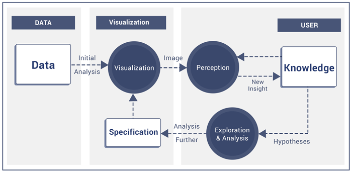
Like any other process, Visual analytics also follow a procedure with the feedback loop, which starts from collecting, scrapping raw data and examining, analysis data from different data sources with human interaction to get the information from knowledge from data. The following figure shows an overview of different stages of Visual Analytics Process.

Collecting and Scraping raw Data from different source: The first step of any process to get the input, same Analytics process requires data, which scraped or collected from various sources like the Internet, social media platform, websites, companies historical information, old financial data, etc.
Store Data and do initial analytics: The second step to store the data in the form of the database table, CSV files, json, etc. and do the initial analytics using different data analytics tools and method and get the useful information.
Visualize the Data: Now it’s time to visualize the data in the form of graph, charts, tables and UI components and create a perception.
Exploration and Analysis of the Data: Next step to explore more on the data and get the desired output for the companies with different specification and visualize the data interactively with the help of visualization tools.
What is the role of Visual Analytics and Data Visualization?
Many people are confused by the new term visual analytics, and data visualization and do not see differences, While there is some difference and play a different role in different sectors, such as :
- Data visualization is nothing but to represent the data in the form of a pictorial, graphical and interactive manner. Data analytics is also a process of enquiring, examining, decision-making, combining visualization, human factors and analyze hidden data sets and derive meaning data.
- Data analysts turn complex data set into readable plain text (English), whether its sales figures, market research or stocks, logistics, or transportation costs, and social media states.
- Weather Data Visualization engineer turn that readable plain text in the form of charts, graphs, and design elements, that help business explain trends and stats more easily.
- Data Visualization & Data Analytics are related to each other in the form of the sector they used; both are related to the same industry like Finance, Banking, Healthcare, Retail, Crime detection, Daily trends Analysis, etc. D
- ata Analytics help the above sectors to Identify the current market trends, future forecast and to analysis the monthly, early growth of a business and support business to be proactive for the future growth using the data visualization tools to represent the interpreted data in the readable format. Computers made it possible to make use of data analytics tools to process complex data at high speeds.
What are the top Data Analytics tools?
- Hive
- Apache Spark
- R Programming
- Python
- Polybase
- Presto
- Trifecta
- Excel /Spreadsheet
- SAS
- SAP Business Intelligence
What are the best Data Visualization Tools and its Applications?
The primary goal of the data visualization is to visualize the data or information in an interactive, efficiently, and graphical manner to the users. To analyze the vast amount of data or big data and show that data to the user in an efficient manner is not an easy task. As human brain process visual content better than it processes plain text, so to show the data interactively, need to classify and analyze the data, for easy understanding and to represent data in a visual form. This visual form can be a chart, graphs, lists, tables or a map, etc. Here are some widely used and most popular Data Visualization tools and application which helps people to understand and represent the data in graphically and interactively manner:
Highcharts – Make data come alive
Highcharts is a JavaScript charting library including the variety of charts with live demo and customization options. Highcharts includes three different type of charts (Highcharts, Highstocks and Highmaps) to visualize & manipulate data, and set up the interactive dashboard from the various data source. Highcharts are beautifully animated, fully customizable, and supports live data streams. It’s free to download and use for non-commercially and licensable for commercial use. You can also play and customizable Highcharts demos using, JSFiddle, Codepen, and Highcharts Cloud.
Plotly JS – Modern Visualization for the Data Era
Plotly Js is a fastest growing open-source visualization libraries for R, Python, and JavaScript. Plotly creates leading open source tools for composing, editing, and sharing interactive data visualization via the Web. Their collaboration servers allow data scientists to showcase their work, make graphs without coding, and collaborate with business analysts, designers, executives, and clients.
D3.js- Data-Driven Documents
D3.js is an open source and core JavaScript based library, use HTML, SVG, Canvas, and CSS for manipulating data and visualize the data in the form of graphs, tables, maps, and diagrams with different types of data and data sources. D3.js is open source, and use web standards, which gives the user full capabilities of manipulating and visualize the data without any framework with the full support of modern browsers.
FusionCharts – JavaScript charts for web & mobile
The most comprehensive JavaScript charting library, with over 90+ charts and 1000+ maps. Loved by 27,000 customers in 118 countries. FusionCharts gives you complete flexibility & comes with extensive JavaScript API that makes it easy to integrate it with any AJAX application or JavaScript framework. These charts, maps, and dashboards are highly interactive, customizable and work across all devices and platforms.
Vis.js – A dynamic, browser-based visualization library
Vis.js is a dynamic, open source, browser-based visualization library, which is easy to use, handle and manipulate large amounts of dynamic data, and render data in the form of canvas, according to our requirement. Vis Js is open source library, and everybody can contribute. This library consists of DataSet, Timeline, Network, Graph2d, and Graph3d.
CanvasJS – Responsive HTML5 Charting Library
CanvasJS is Responsive HTML5 Charting Library with a Simple API and 10x Performance with supports of 30 different types of Charts with the live demo. CanvasJS helps us to create rich interactive, customizable multi-theme dashboards and can render 100,000 Data-Points in just a few hundred milliseconds that work across devices (including iPhone, iPad, Android, Mac & Pcs.) without compromising on maintainability or functionality of the web application.
Tableau – Business Intelligence Software
Tableau is paid business intelligence software with 14 days trial that helps people see and understand their data. Tableau is 100x faster than existing solutions & visualize the data in minutes from the different data source (spreadsheets, databases, Hadoop, cloud services, or any data). Tableau is easy to use; anyone can analyze data with intuitive drag & drop products and create an interactive smart dashboard, without any programming knowledge.cs.) without compromising on maintainability or functionality of the web application.
Chart.js – Simple & flexible JavaScript Charting Library
Chart.js is Simple & flexible JavaScript charting Library for designers & developers to Visualize the data in 8 different ways, which are animated and customizable. Chart Js render data in the form of HTML5 Canvas, support all modern browsers with high performance. Charts Js charts are highly scalable and responsive according to the device.
amCharts – JavaScript Charts & Maps
amCharts is javascript based Charting library, with three different product JavaScript Charts, JavaScript Stocks Charts, and JavaScript Maps. The amCharts free chart library under the linkware license, this means you may not remove or hide the website links of amCharts from the product or website, where you are going to use it. If you want to use the am Charts without the amCharts website link, you have to purchase the commercial license. amCharts come up with the vast number of tutorials, tips, demo code, and online chart editor that will help you quickly understand and visualize the complex data.
Sigma JS – Publish Networks on Web pages
Sigma is a JavaScript library provides a lot of built-in features, such as Canvas and WebGL renderers or mouse and touch support, for graph drawing and to make networks manipulation on Web pages. It makes easy to publish networks on Web pages and allows developers to integrate network exploration in rich Web applications. There are many different resources are available, which help the users to quickly understand and implements Sigma Js with the projects, such as the Wiki, GitHub, Different use cases, and tutorials, with full support to resolve the issues on the Github repository.
What is Highcharts?
There is no limitation to use only Highcharts; it’s just a Javascript library as others, which are discussed above along with many more. It depends on the developer and the organization to use a platform which suits them best and fulfill their requirement. The reason behind using HighCharts for financial sector with large and complex data is: HighCharts includes three different type of charts (Highcharts, Highstocks and Highmaps) which can fulfill any business need.
HighCharts are beautifully animated, interactive, fully customizable, and supports live data streams. HighCharts is very fast and supports large of data from the different data source like CSV, JSON, etc. along with data from live streaming. HighCharts is easy to learn, it simple use the javascript and JSON based configuration along with proper documentation and also provide customizable Highcharts demos on JSFiddle, Codepen, and Highcharts Cloud. Last but not least Highchart is free to download and use for non-commercially without any barrier of the trial period and console error like many another library.
Implementation of Highcharts with React Js
To Implement HighCharts with the React JS projects use official NPM package, which contains Highcharts, Highstock and Highmaps plus all modules. Start by installing Highcharts as a node module and save it as a dependency in the package.json:
- Install HighCharts from official npm package: npm install highcharts –save
- Import HighCharts to the React Project: Import HighCharts import Highcharts from ‘highcharts/highcharts’; Import Highstock or Highmaps import Highcharts from ‘highcharts/highstock;
- To Import HighCharts additional module for Maps, Treemap: For e.g.: Import map.js for Map require(‘highcharts/modules/map.js’)(Highcharts); Import treemap.js for Treemap require(‘highcharts/modules/treemap.js’)(Highcharts) Note: Import modules after Highcharts using require
- Creating the chart: Create a container with the ID “chart-container” and add the following code with the chart configuration option in componentDidMount() function. Highcharts.chart(‘chart-container’, { Highcharts configuration options }); Now, ready to add the configuration files and customize the HighCharts with the React JS Project to visualize the data in a different form.
Demo of Financial Stocks Data using Highcharts and React.JS
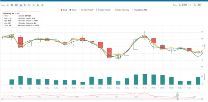
Here is a screenshot of HighCharts multi panes charts where Line charts, Candlestick, Bar charts and range charts are combined in a single core chart with full customizations of every feature.

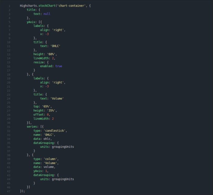
It shows the ten years data for stocks prediction, Confidence level, OHLC along with the daily volume. Here is simple demo code for the above chart:

Conclusion of Visual Analytics
Visualize the vast and complex data interactively and graphically is the major problem of the current technology world and many organizations are working on this to give the users the best solution. There are many Visual Analytics and Data Visualisation tools, which fulfill the business need. As in technology, world data is continuously increasing day by day and becoming more complicated to analyze, store and visualize the millions of data-set inefficient and readable manner an organization needs to focus more on this.


